Expat.com
Subscribe to the topic
Post new topic
First impressions are that it is not as clear as Expat.com and the biggest problem of all is that when you open up a topic to have a look it starts at the very beginning, it would be much better if you went straight to the latest posts, as you could before.
Ray
Agreed! The old layout also looked "warmer" / less sterile and I found the navigation clearer. For example, now if you reply to a topic you can no longer read what the others have written... And I had issues opening the e-mail links on my mobile today.
I second that. Anyone else getting headaches from the all white background? I find it way too bright and it's annoying having to reduce the screen brightness just for expat.com. It's difficult to see the flags in the signatures, too, they're tiny and sometimes misplaced (at least for me).
I love being able to disable contact requests though! Didn't find that option before and had to reject them daily from random men from Saudi Arabia... I give it a 7/10 
its awful , i hate the huge circle things next to the posts in the forum list - it looks like a child made it
Terrible format, nothing like I expected and everything now takes ages to load.
The white background makes it very difficult to concentrate on what is written.
Why no avatars showing?
Terry
I agree that the white background is too bright and glaring and the rest of the colours are not very nice
tearnet wrote:Terrible format, nothing like I expected and everything now takes ages to load.
The white background makes it very difficult to concentrate on what is written.
Why no avatars showing?
Terry
You're using IE? I had this problem with IE11....they work fine in Chrome.
Romaniac
F0xgl0ve wrote:First impressions are that it is not as clear as Expat.com and the biggest problem of all is that when you open up a topic to have a look it starts at the very beginning, it would be much better if you went straight to the latest posts, as you could before.
Ray
The fact that the topics are spaced out more and the wish-washy grey and blue means they are not so clear and you have to scroll down the page to see if there is anything new, whereas before, you could see new posts as soon as the page launched!
But worst change for me is having to scroll down 3 or 4 (or more) pages to read a new post at the end of it.
Good job there aren't any really active viable alternatives now or I for one would be using the site less!
Ray
I don't like chrome so don't use it.
Its not my problem but the new format, I'll just use the site less and less!
As I said before everything now takes ages to load.
Very disappointed 
Terry
Have to agree with the changes, it's quite terrible. I can only see 6 posts at the same time without scrolling. They are waaaaay too big compare to the old layout. There should be an option to reduce the size of the posts and show more. It was much cleaner and easier to see.
Besides the new page "i.e. Handy Tools menu" doesn't work on Chrome, not sure why. 
tearnet wrote:I don't like chrome so don't use it.
Its not my problem but the new format, I'll just use the site less and less!
As I said before everything now takes ages to load.
Very disappointed
Terry
I hate Chrome with a passion, it is so invasive and tries to take over everything. Equally, I will not use IE (which is now technically defunct in Win10) either as it is too slow and cumbersome.
Ray
I do slowly started to dislike it too. Take up too much memory, many websites doesn't work or are not optimized to it. The only thing keeps me here is the integration with other google services(like google now, my search history, password, android on phone) and the wide range of extensions.
I prefer to give it some time to bed in.
This is a massive change, so I believe it would be unfair to do anything but provide helpful posts indicating faults and problems.
I have confidence the team will fix the lot very shortly.
Fred wrote:I prefer to give it some time to bed in.
This is a massive change, so I believe it would be unfair to do anything but provide helpful posts indicating faults and problems.
I have confidence the team will fix the lot very shortly.
I wish I had!
Ray
I accept that it may take time to get used to or refine the look but the slow loading is unacceptable.
The pages are taking 20 to 30 seconds to load!
Terry
tearnet wrote:I accept that it may take time to get used to or refine the look but the slow loading is unacceptable.
The pages are taking 20 to 30 seconds to load!
Terry
I've just timed one at a little over 3 seconds.
That's much slower than before but hardly a problem, so I wonder if yours is a local problem.
Fred wrote:tearnet wrote:I accept that it may take time to get used to or refine the look but the slow loading is unacceptable.
The pages are taking 20 to 30 seconds to load!
Terry
I've just timed one at a little over 3 seconds.
That's much slower than before but hardly a problem, so I wonder if yours is a local problem.
Mine's even faster - lightning fast to be precise. It loads in a split second! I'm using Chrome though and we have very fast internet in Ireland. Wondering how it's going to be in Malta...
For me the speed of loading the page is not a problem, either.
Still, the colours and the huge dimensions are!
I don't have a high-res screen, just a 5-year-old cheap flat screen, and my notebook - so maybe on the (possibly very expensive) screens of web designers the colours come out fine, but for me it's hard to make out the bright grey (or blue?) background of the posts against the glaring white of the whole page, and the grey letters... All in all, it's simply an unpleasant experience and I have to concentrate a lot to read - so more contrast would definitely be a good thing! And I am of the opinion that for any good website it should be possible to view it in any browser and on any screen without damaging your eyes In other words, I'm certainly NOT going to buy a new computer screen just to be able to view expat.com!
The flags below the posts are very hard to make out (white flag on white background, e.g. Maltese flag, English flag, ...) Maybe a black frame would do the trick, although I've been told by my sister, who is a web designer, that that looks "ugly".
The large dimensions are a particular problem for me when opening the site on my notebook (17 inch screen, I think). When I open the site, all I see is the picture on top of the page - nice, but not very helpful, and I have to scroll a lot, which is annoying!
I hope the expat-blog team (sorry: expat.com team) do take all this feedback seriously and try to address these issues rather quickly - otherwise I fear some of the great members here might actually leave the site for good, and that would be a shame! (So, Terry & Ray, please don't leave yet You've been so helpful to everyone here!)
Hi everyone,
thanks for your first feedbacks.
We've identified many bugs and improvements. Please give us a few days to fix everything, adjust sizes, colors and so on.
All the best,
Julien
Thanks Julien for taking all the feedback seriously
This has been a great site for all the great members giving great advice, and I hope it continues that way!
Bernie
We are obviously taking your feedback very seriously. We'll do our best to improve things in the coming days
OK, the pages are now loading quickly. 
I think the most immediate issues are the contrast colours and the size of the pages.
Its not just about holding on to the old members but getting visitors to stay and join.
Remember "first impressions last"
Terry
Good to know that these areas are being looked at.
By far the biggest issue for me is not being able to go to the latest post with one click which we could before but now we have to scroll all the way through all pages
Ray
F0xgl0ve wrote:Good to know that these areas are being looked at.
By far the biggest issue for me is not being able to go to the latest post with one click which we could before but now we have to scroll all the way through all pages
Ray
Just checked a few topics and those that don't have the 'new' button showing seem to start at post number 1 and of the three with the 'new' button (on my computer) either start at the last post or at a random point such as this topic which jumps to post number 17!
I am sure there is logic somewhere.
Ray
There are a bunch of comments, issues and suggestions on several forums; plenty to keep Julian awake for a week or three.
I've already noticed a few things are fixed and I'm sure the rest will get sorted soon.
The flag issue seems to be fixed They're no longer split in two lines but instead on one and looking good! Now we just need a slightly improved colour scheme and the automatic jumping to the last post.
I think this new design is very trendy at the moment, it's supposed to be a clean look but if you're not careful it can look too sterile. Did anyone else notice a strong resemblance to the Nomadlist website? Same background, circles in the forum and menu also very similar.
blackangelheart wrote:The flag issue seems to be fixed
I think this new design is very trendy at the moment, it's supposed to be a clean look but if you're not careful it can look too sterile. Did anyone else notice a strong resemblance to the Nomadlist website? Same background, circles in the forum and menu also very similar.
I can see no difference in the flags,they are still hard to distinguish in many cases.
As for the Nomadlist website I would think that very few members of this site are in to 'Trendy' and few will have heard of, it let alone used it, but yes it is also very dull and wishy washy.
I guess as you have only used the old site as a member for a few days you have not had the chance to get used to it and the differences are not so striking.
Ray
Yesterday the site was very slow to load but I could see all the avatars, today fast loading but no avatars?
Instead of an avatar it shows a green blob.
It looks like they threw out the baby with the bathwater when they redesigned the site!!!
Terry
F0xgl0ve wrote:blackangelheart wrote:The flag issue seems to be fixed
I think this new design is very trendy at the moment, it's supposed to be a clean look but if you're not careful it can look too sterile. Did anyone else notice a strong resemblance to the Nomadlist website? Same background, circles in the forum and menu also very similar.
I can see no difference in the flags,they are still hard to distinguish in many cases.
As for the Nomadlist website I would think that very few members of this site are in to 'Trendy' and few will have heard of, it let alone used it, but yes it is also very dull and wishy washy.
I guess as you have only used the old site as a member for a few days you have not had the chance to get used to it and the differences are not so striking.
Ray
I do notice the difference of course. Been reading this forum for about a year now but not as a member :-) With trendy I didn't mean that I like it, just that these days white websites seem to be trendy in the eyes of a webdesigner but in reality users don't like it much.
Regarding the flags, I was talking about the issue where they would appear on two lines. This has been fixed now, no more line break But agree, the colours still make it hard to distinguish. White on white is just not good!
Is it the new website that has confused members? I have now found 3 replies to old posts from 'Roadtripper' that refer to posts from 3 months ago which presumably having being opened , came up with the original post first!
Ray
F0xgl0ve wrote:Is it the new website that has confused members? I have now found 3 replies to old posts from 'Roadtripper' that refer to posts from 3 months ago which presumably having being opened , came up with the original post first!
Ray
Its certainly confusing me.
Terry
Articles to help you in your expat project in Malta
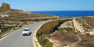 How to drive in Malta
Malta is a relatively small island measuring only 27km long and 14,5km wide, so it seems on paper to be very ...
 Accidents and emergencies in Malta
A stay abroad is usually associated with great memories. However, it could happen that an accident or emergency ...
 Resident and work permit for Malta
Getting a resident card and a work permit in Malta is an essential step for any expat. Living in Malta does ...
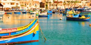
 Finding work in Gozo
If you are planning to live in Malta, why not settle and work in Gozo? Although it is quieter than the main island ...
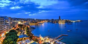 Accommodation in Malta
As an expat in Malta, one of the first steps is to find accommodation. Malta has a quickly and continuously ...
 Phones and internet in Malta
Despite being a small archipelago, Malta hosts a very advanced telecommunications network. If you are ...
 Education in Malta
The schooling system in Malta reflects the former British governance of the country. Parents may choose from state ...
 Finding work in Malta
Malta is world famous for its postcard-worthy beaches and beautiful landscapes. Indeed, this tiny island nation ...
Find more topics on the Malta forum